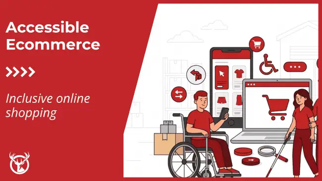
Creating eCommerce accessibility for your store is the right thing to do for your audience. Every customer should be able to enjoy your site, browse your selection, and purchase your products. In this post, we’ll look at ways to make your site more inclusive and supportive. Thankfully, many eCommerce-focused tools help websites reach their entire audience with visual, auditory, and other changes.
As a 3PL with ecommerce in our DNA, Red Stag believes in keeping customers current on the latest best practices. We originally published this article in July 2017. We’ve updated it with new research, tools, and support options and republished it most recently on November 8, 2021.
Understanding audience needs
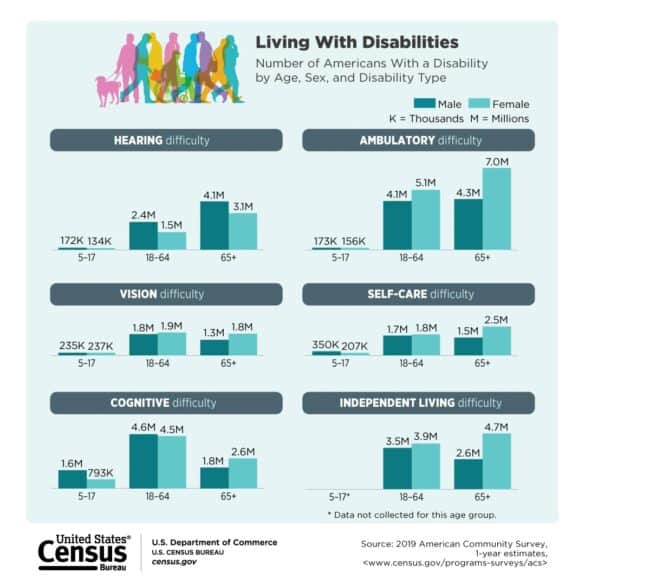
According to the World Bank, approximately 15% of people worldwide experience some form of recognized disability. In the U.S., the Census Bureau says roughly one-quarter of people have have a recognized disability, including millions children and potentially as many as 10 million people active in the workforce. All websites should be inclusive of Americans with disabilities, be they customers, colleagues, or someone looking to learn more about your industry.

There’s no question that 61 million people (in the U.S. alone) is a significant number of people. According to the CDC, 1-in-4 U.S. adults have some type of disability. Unfortunately, developers often overlook website accessibility for disabled people in design basics, especially in areas like eCommerce. Searches, ads, social posts, and other content may direct these individuals to sites that aren’t welcoming, creating a frustrating experience.
Making eCommerce accessibility a focus of your design helps improve all customer experiences and creates a connection with visitors. It’s a good policy and demonstration of company values. Inclusivity is also a favorable business decision because you’re available to more consumers, comply with legal requirements, and avoid search engines’ penalties for lacking accessibility.
Compliance and requirements for eCommerce accessibility
Working on eCommerce accessibility is more than just making your store available to as many people as possible. You’ll also need to consider how to comply with the Americans with Disabilities Act (ADA) and the Web Content Accessibility Guideline (WCAG).
The ADA generally requires non-profit services and U.S. businesses to make their websites accessible to people with disabilities. It covers requirements for the general public and employees — if your business has more than 15 employees — which may impact the design of your internal systems and the outward-facing store. The WCAG is an internationally recognized set of guidelines for digital accessibility that many U.S. agencies and courts use to determine technical requirements for compliance.
Even if your compliance isn’t legally mandated, most small business owners can benefit from meeting these standards anyway. Compliance encourages more visitors and can reduce potential liability issues.
How do you make sure your eCommerce store is ADA compliant?
There are several critical criteria on the ADA checklist that your online store will need to adhere to so that you avoid compliance problems. Some of the essential eCommerce accessibility requirements include:
- Ensuring that you have an alt tag on every audio file, video, image, and file on your website
- Providing detailed text descriptions for any complex graphics on your eCommerce store
- Providing captions on and audio description options in all videos
- Verifying that your web pages don’t contain any images that flash repeatedly
Visual impairments
Another major factor that’s not always considered when designing an online store is visual impairments. For example, there are problems some people experience have when viewing a page because they have an issue with color blindness.
It’s worth remembering that the global figures for color blindness are surprisingly high, with 1:200 women and 1:12 men suffering from color blindness. People with this concern have difficulty distinguishing between colors when interpreting what they see on a web page or elsewhere. This concern makes it challenging to see different elements when designers don’t consider color contrast and similar elements.
Color selection
You can take many steps to create an accessible eCommerce website for people who have color blindness. One of the primary objectives is to make sure the colors you use are from opposite ends of the color wheel. This will ensure they contrast dramatically and stand out to color-blind users. Many designers say this eCommerce accessibility focus also improves use for every site visitor.
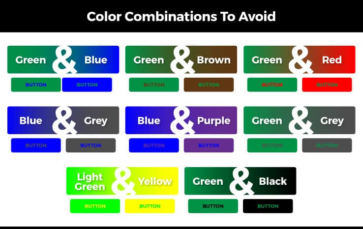
Equally, avoid certain color combinations if you’re going to make your online store user-friendly to color-blind visitors. These are:
- Green/blue
- Green/brown
- Green/red
- Blue/grey
- Blue/purple
- Green/grey
- Light green/yellow
- Green/black
Other visual best practices
Here are some other design features that will ensure that color-blind users can easily read and navigate your site:
- Use different shapes and textures for different elements on your web page so that it adds other distinguishing features besides colors
- Avoid text over images unless they contrast significantly
- Look to add a text label to color swatches so users can hover over the color to see what it is
- Provide link recognition by using more than just color
- Consider adding icons or underlining them so that it’s clearer they are links
- Help make alert messages stand out by using icons or prefix text
- Remember that alerts usually are distinguished with red or green colors, but those suffering from achromatism won’t be able to distinguish these
- Exclamation marks or ticks are great symbols to distinguish messaging and intent
- Words like “Success” or “Error” can help distinguish messaging and intent
- Flag required form fields with asterisks or “required” instead of just using colors to differentiate required and non-required ones
Some useful design tools help you see your online store like a color-blind user. ColorOracle.org helps you see what people with visual impairments will see when they visit your site. The Contrast Checker on WebAim.org can test whether two colors pass the guidelines for accessibility.
Access for people with visual impairments and blindness
According to World Health Organization figures, more than 2.2 billion have a vision impairment, including nearly 50 million blind persons. The Internet is a daily part of many of their lives, thanks to accessibility tools. So, they’ll naturally shop from accessible eCommerce websites tailored to their needs.
You can do several things with your online store to accommodate as many visually impaired visitors as possible. First, test your website to make it compatible with screen readers. WebAIM has suggestions on which screen readers to test and how to run those tests. Remember that eCommerce accessibility practices are always best pratices.
You also can consider using larger text, multiple types of header tags, and supporting screen magnification. Be proactive with your website design to ensure it’s capable of accommodating the latest browser versions. Support both text-only and zoom features without breaking the layout of your site.
Furthermore, people have recognized eye diseases such as cataracts and glaucoma, which have a detrimental impact on their ability to distinguish contrasts. Modern site design often tends to rely on subtle gradients. But, to make your online store more accessible for people with common eye diseases, consider the idea of creating a second version that’s more contrasting.
Another helpful design trick would be to opt for bold text when you are using low-contrast features. Also, avoid any thin-style fonts that can prove difficult to read. Skip any CSS or JavaScript techniques that inhibit users from highlighting text. Many people with visual impairments will highlight elements to add contrast to something they’re struggling to read.
Mobile eCommerce accessibility
A growing number of people access web content via mobile devices, like a smartphone or tablet. Consider this aspect when designing your site. Mobile sites tend to be more accessible for people with vision impairments. Many users will want to switch to your mobile site for that improvement and assistance.
Make it easy to switch to the mobile site and test to ensure this doesn’t cause compatibility problems. It’ll improve the overall visibility and accessibility of your eCommerce site.
Use space around your website elements to remove and make it easier for customers to see or read. This adjustment will help people with vision difficulties, such as blurred vision or issues with contrasting colors, to navigate the site with greater ease. It also makes it easier to design a mobile site version that is useful and fully functional.
One thing that companies may overlook here is the use of keyboard shortcuts. Enabling these on your website, including on the mobile version, makes it easier for everyone to navigate. Keyboard shortcuts, such as the arrow keys for navigation, minimize the need for using a mouse and reduce the difficulty of finding or moving the cursor on the screen.
CAPTCHA codes can present a dilemma when balancing the need to eliminate spam and its difficulties for people with vision impairment. Some users might find it almost impossible to distinguish or decipher the characters included within the code. This text does not resize when zoomed, which can compound the difficulty.
The W3C presents some potential alternatives to CAPTCHA, or you could ask relevant questions instead of using any CAPTCHA system.
Website problems for people with hearing loss
Although you might consider that your online store is primarily a visual experience, it’s worth remembering that there are around 466 million people worldwide who suffer from some form of hearing loss, according to the World Health Organization. Include them in eCommerce accessibility efforts.
People with hearing loss or are deaf face several challenges when they come to an unoptimized online store. This experience can spoil their enjoyment of the content or lead them to click away if they cannot access the content comfortably. Stores can overcome such issues with targeted design initiatives.

When you have a video or audio feature on your site, consider including subtitles so users can read the spoken words. Alternatively, think about creating a transcript they can read at their own pace. Search engines like Google reward you for providing a transcript on the same screen as the video, both for supporting eCommerce accessibility and by using relevant keywords more.
Consider the idea of offering sign-language videos on your site. If someone’s struggling to read the text on your site or hear a voice in your video, a sign-language option will transform written content into something they can engage with easily. These can be slightly more expensive to produce, but it’s worth remembering that ASL is the first language of most deaf and hard-of-hearing individuals. That’s many visitors who might find this option useful.
Addressing fine motor control concerns
Unfortunately, designers can often overlook people with fine motor problems with their eCommerce accessibility efforts. These individuals have unique needs to address, such as difficulty clicking on small buttons or form fields placed close together. Best practices recommend you leave at least 2 mm between each box.
Individuals with these health concerns also benefit from keyboard access. Include shortcuts that allow for navigation on your menus, radio buttons, and form fields.
Older Americans and shoppers are often included in this group because motor skills can decline during our lives. Many elements discussed here and above, such as larger text, can help your older shoppers.
Memory concerns and eCommerce accessibility
Also, you should allow for short-term memory concerns or the possibility of confusion. That means designs where users don’t have to remember how to use your eCommerce website’s interface. Aim to gradually offer new information that you present on-screen and add reminders and cues where possible. Try not to place tasks on multiple screens and avoid the use of pop-ups where possible.
It’s a good idea to remove any distractions from the page, including sounds and movement, as this may prevent them from completing what they’re doing. Allow sufficient time for users to fill out forms before the page times out.
Keep the language simple, avoid complex terms, industry jargon, and long sentences so that your site is easy to navigate and use for all. That’s always the top goal for eCommerce accessibility efforts.
ECommerce accessibility is easier than it seems
Although some of the features mentioned may appear time-consuming and expensive to implement, many of them are easy and inexpensive to carry out. Create an online store that is accessible to as many different users as possible. You will increase your chances of attracting more shoppers with disabilities, which will help increase your revenue.
Taking the time to plan how to accommodate more disabled visitors to your site is a win-win situation, and your efforts can translate into increased sales and more positive feedback from customers.
More reading and resources:
- https://www.worldbank.org/en/topic/disability/overview
- https://www.census.gov/newsroom/releases/archives/miscellaneous/cb12-134.html
- https://www.shopify.com/partners/blog/why-and-how-to-improve-ecommerce-website-accessibility
- https://www.techrepublic.com/blog/web-designer/creating-an-ada-compliant-website/
- https://www.colourblindawareness.org/colour-blindness/
- https://www.smashingmagazine.com/2016/06/improving-ux-for-color-blind-users/
- https://www.who.int/mediacentre/factsheets/fs282/en/
- https://mashable.com/2011/04/20/design-for-visually-impaired/#65UFMpp0RPqJ
- https://www.who.int/mediacentre/factsheets/fs300/en/
- https://www.w3.org/WAI/older-users/developing.html
- https://www.perkins.org/stories/three-tips-to-make-your-website-accessible-for-people-with-disabilities
- https://www.ada.gov/pubs/ada.htm
- https://colororacle.org/
- https://webaim.org/resources/contrastchecker/
- https://www.who.int/mediacentre/factsheets/fs282/en/
