The best 3PL companies aren’t one-size-fits-all — the right pick depends on what you ship, how much you ship, and where your customers are. For lightweight DTC at scale, that’s ShipBob; for heavy, bulky, and high-value items, Red Stag Fulfillment; for subscription boxes, ShipMonk. There’s no single “best overall” 3PL, so below we match each provider to the product profile it actually serves best.
We evaluated 50+ third-party logistics providers and narrowed to 10 based on accuracy SLAs, warehouse footprint, carrier-rate strength, and platform integrations. Below is a side-by-side comparison, then honest breakdowns of each pick, including the limitations each provider won’t put on their homepage.
Quick comparison: Top 3PL companies by specialty
| Top 3PL Companies by Specialty | ||||
|---|---|---|---|---|
| 3PL Company | Best For | Key Differentiator | Locations | Accuracy Guarantee |
| ShipBob | Lightweight DTC at scale | 60+ fulfillment centers globally; 12+ integrations | 60+ (Innovation Centers + SFN partners) | 99.95% claimed, no financial backing |
| Red Stag Fulfillment | Heavy, bulky, fragile, high-value items | $50-per-error financial guarantee; 96% US 2-day ground | 2 US warehouses (Knoxville TN, Salt Lake City UT) | 100% order accuracy, financially backed |
| ShipMonk | Subscription boxes, crowdfunding | Robotic automation across 12 owned facilities | 12 (US, Canada, UK, Czech Republic) | No public guarantee |
| Amazon FBA | Amazon-first sellers | Automatic Prime eligibility; published rate card | 175+ Amazon fulfillment centers | No third-party guarantee |
| LVK Logistics | Apparel on Shopify | ShipHero WMS; garment-on-hanger; Section 321 cross-border | 7 North American locations | No public guarantee |
| Renewal Logistics | Apparel and footwear with damage recovery | Garment restoration; mold remediation; circular returns | 3 US (Georgia, California) | Near-100% claimed |
| DCL Logistics | Electronics, medical, beauty | ISO 9001; eFactory + SelectShip platforms; 40-year track record | 7 fully owned US locations (CA, KY, PA) | Near-100% claimed |
| Buske Logistics | Mid-market B2B and regulated industries | Asset-based 7.5M+ sq ft; Fortune 500 client roster | 40 US/Canada locations | No public guarantee |
| Saddle Creek Logistics | Mid-market omnichannel | 46 US facilities, 31M sq ft; bundled transportation | 46 US locations | No public guarantee |
| Speed Commerce | Lightweight DTC with contact center | Fulfillment bundled with in-house ecommerce contact center | 3 US locations (IL, CT, CA) | No public guarantee |
Updated July 2026.
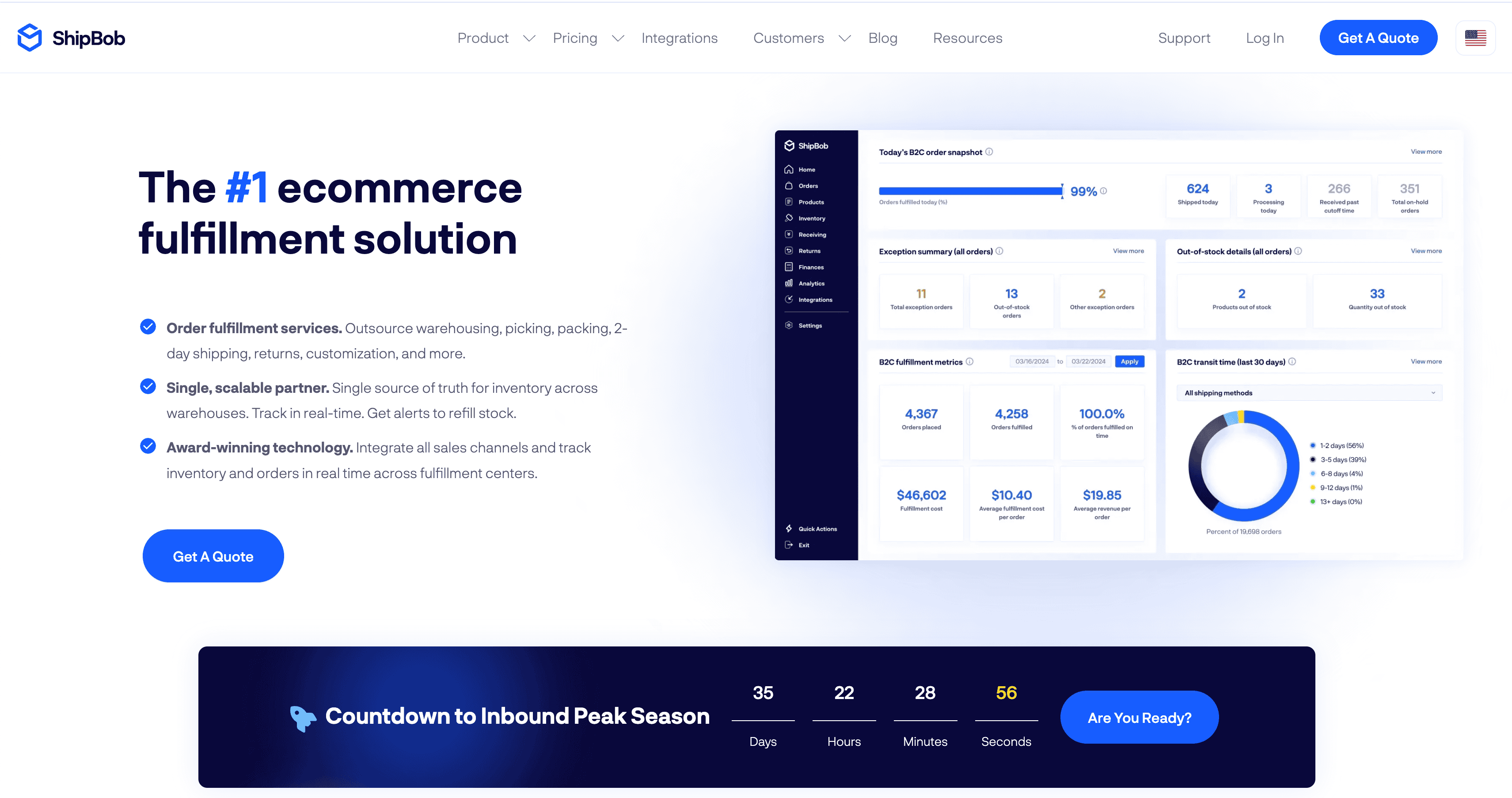
ShipBob — Best for lightweight DTC at scale
For DTC brands shipping lightweight goods at 500+ orders per month with global ambitions, ShipBob operates 60+ fulfillment centers across the US, Canada, UK, EU (Rotterdam), and Australia (Melbourne). That’s the broadest international footprint of any independent ecommerce 3PL on this list.
Why they stand out:
ShipBob integrates natively with 12+ ecommerce platforms: Shopify, Amazon, BigCommerce, WooCommerce, Walmart, TikTok Shop, eBay, Etsy, Squarespace, NetSuite, plus EDI and REST API access. Their published minimum is 250 orders/month, so smaller brands can get in. Established brands distribute inventory across the network to cut shipping zones and transit times. They also offer a hybrid model: use ShipBob’s WMS in your own warehouse alongside ShipBob-operated facilities. The merchant dashboard is the strongest operator UI in this category.
The hybrid network has a wrinkle worth understanding. ShipBob operates company-owned “Innovation Centers” directly, plus a 40+ partner network they call the Supply Chain Fulfillment Network (SFN). The Innovation Centers run on ShipBob’s proprietary WMS with their service standards. The SFN partners are independent 3PLs operating under the ShipBob brand. Service consistency varies between the two tiers. The ShipBob sales process doesn’t lead with that distinction.
Limitations: The practical sweet spot starts around 500 orders/month, not the 250 published minimum. Under that volume, per-order economics get punishing. Bulky or fragile items aren’t a fit; ShipBob is built around standard-sized lightweight DTC. Pricing is custom-quote with no published rate card, and merchants consistently report effective landed costs running above the initial sales quote. ShipBob’s Trustpilot rating sits at 3.8/5 with about 17% one-star reviews, most citing post-onboarding support drops and offboarding friction. ShipBob doesn’t offer financially backed accuracy guarantees the way Red Stag does.
If software experience is the deciding factor, ShipBob wins on UX even when they lose on price.
Best for: DTC brands shipping sub-5-lb goods at 500+ orders/month who need global distribution.
Not for: Very small merchants, oversized or regulated SKUs, or founders who need transparent published rates.

Red Stag Fulfillment — Best for heavy, bulky, and high-value
For ecommerce brands shipping items over 10 lbs, oversized packages, fragile goods, or high-value inventory, Red Stag Fulfillment operates two US warehouses in Knoxville, TN and Salt Lake City, UT. The two-warehouse positioning reaches 96% of the continental US within 2 days by ground. That eliminates the Zone 6–8 surcharges that drain margins when you’re stuck with a single coastal warehouse.
Why they stand out:
Red Stag pays $50 for every fulfillment error. Not a credit. Not a “we’ll make it right” promise. A $50 payment per mistake, written into the service agreement. They also reimburse the full wholesale cost of any missing inventory (zero-shrinkage guarantee) and commit to same-day fulfillment SLAs with contractual accountability.
For brands shipping products over 10 lbs, Red Stag’s negotiated carrier rates could run up to 15–30% below standard ecommerce rates. On a brand shipping 3,000 orders/month at an average of 15 lbs, that’s roughly $4,500–$9,000/month in shipping savings from the potential of negotiated Additional Handling Surcharge and Large Package Surcharge discounts alone.
The platform integrates with Shopify, Amazon, WooCommerce, BigCommerce, Magento, and seven other ecommerce carts. Red Stag is also lithium-ion certified, with an explicit e-bike service line and no extra fee for battery storage. That matters for the growing slice of DTC brands shipping products with embedded batteries.
Red Stag isn’t right for everyone. Apparel and footwear-only brands shouldn’t use Red Stag. We don’t run garment-on-hanger or returns re-inspection. Brands with 10,000+ active SKUs will hit our practical floor. Lightweight ecommerce shipping sub-5-lb products at high volume may find better per-unit economics with a larger-network provider like ShipBob or Speed Commerce. We’re also focused on US-only, so brands with international fulfillment as the primary need should look at ShipBob or DHL Supply Chain for global coverage. Pricing is custom-quote based on your specific order profile, not a published rate card.
Best for: Ecommerce brands shipping heavy, bulky, fragile, or high-value products that want financial accountability when the 3PL misses.
Not for: Apparel-only brands, sub-5-lb high-volume DTC, or international-primary operations.

ShipMonk — Best for subscription boxes and crowdfunding
For subscription-box, crowdfunding, and tech-forward DTC brands, ShipMonk operates 12 owned-and-operated fulfillment centers across the US, Canada, UK, and Czech Republic with heavy investment in robotic warehouse automation.
ShipMonk’s robotic picking and packing systems deliver high throughput and consistency at scale. That matters for subscription box and crowdfunding fulfillment, which involve variable kit configurations and irregular demand spikes from campaign launches. Their fee structure includes free receiving and well-priced returns processing. ShipMonk added apparel returns and inspection capability at their Louisville KY2 facility in 2026, expanding their reach into apparel DTC.
ShipMonk also has the lowest volume floor of any pick on this list: no order minimums per their published policy. That makes them an entry point for startups that haven’t yet hit ShipBob’s practical 500-order floor.
Limitations: Automated systems work best with standardized products. Large, fragile, or irregularly shaped items don’t flow through ShipMonk’s robotic setup smoothly. Merchant reports flag billing complexity and surprise line items, with some accounts reporting 6+ month exit timelines where billing continued through the offboarding period. Reporting and analytics lag the category leaders. Pricing favors established brands with predictable monthly volumes over early-stage spikiness.
The ShipMonk OMS gets consistent praise for real-time inventory tracking, deep Shopify sync, and flexible automation rules other 3PLs don’t expose. If subscription-box mechanics or crowdfunding campaign fulfillment are central to your model, the vertical depth is hard to beat.
Best for: Subscription box, crowdfunding, and growth-stage DTC brands needing automated fulfillment with deep Shopify integration.
Not for: Brands shipping oversized or fragile items, or those wanting flat-rate transparent pricing.

Amazon FBA — Best for Amazon-first sellers
For sellers whose primary channel is Amazon and whose SKUs are small, light, and fast-moving, Amazon FBA (Fulfillment by Amazon) operates 175+ fulfillment centers across the US with automatic Prime eligibility. That’s the conversion driver effectively impossible to replicate at scale without FBA.
The biggest draw is automatic Prime eligibility, which unlocks faster shipping badges and stronger conversion on Amazon listings. Per-unit fulfillment fees are tiered by size and weight, which works well for small, light, fast-moving products. Multi-Channel Fulfillment (MCF) lets sellers ship DTC orders from other sales channels out of the same inventory pool, but MCF ships only to US and UK destinations, and the Shopify app supports US addresses only.
Amazon FBA is the rare 3PL with a published rate card. Seller Central’s inventory-age reporting, restock recommendations, and IPI scoring beat what most mid-market 3PLs offer on inventory management.
Limitations: FBA’s tiered fee structure punishes bulky and heavy items. Oversize tier fees, monthly storage costs, long-term storage surcharges, the Inventory Placement Service fee, low-inventory-level fees, and aged-inventory surcharges stack fast on large-package SKUs. As of April 17, 2026, Amazon added a 3.5% fuel and logistics surcharge on FBA fees on top of the existing fee structure, which compounded the cost pressure on heavy and oversized SKUs. Sellers also have limited control over inventory commingling, returns handling, and aged-inventory penalties, and account suspensions can cut off fulfillment without warning. Customer support is template-driven with no dedicated account manager for most sellers, and there’s no option for branded unboxing.
For brands whose center of gravity is Amazon Prime conversion on small fast-moving SKUs, FBA wins. For brands that need DTC custom packaging, brand-building control, or multi-channel inventory pooled without lock-in, a traditional 3PL is the right call.
Best for: Small, light, high-velocity products from sellers whose primary channel is Amazon.
Not for: Bulky or heavy SKUs, brand-building DTC operators needing custom packaging, or sellers wanting multi-channel control without Amazon dependency.

LVK Logistics (formerly Shiphero) — Best for apparel and footwear on Shopify
For apparel and footwear DTC brands selling primarily through Shopify, LVK Logistics (formerly the fulfillment arm of ShipHero) operates 7 owned-and-operated facilities totaling roughly 1 million square feet across the US and Canada, powered by the ShipHero warehouse management system.
Why they stand out:
LVK built their entire operation around apparel handling: garment-on-hanger storage, folding standards, poly bagging, and returns processing for items that need re-inspection before restocking. Same-day-ship cutoffs run 12pm or 1pm ET depending on the service tier. The ShipHero WMS gives configurability most 3PLs don’t expose: direct Shopify plugin, native Loop Returns integration, and Section 321 support for Canada-to-US cross-border shipping under the $800 de minimis threshold.
LVK spun off from ShipHero in August 2024 under CEO Maggie Barnett, who concurrently serves as ShipHero COO. Named customers include Orthofeet and The Chosen.
Limitations: LVK has a merchant-reported 500-orders/month minimum that isn’t officially published on lvk.com. Coverage is US and Canada only. Brands needing EU/UK/APAC fulfillment should look at ShipBob. Post-spinoff customer service had a turbulent stretch in late 2024, with Shopify App Store reviews flagging returns-process breakdowns and weeks-long ticket silence. Some accounts also reported a $500/month tech fee surfacing after onboarding. Their current Trustpilot rating sits at 5.0/5 across ~94 reviews, with responsive support specifically called out, though the gap between Trustpilot reviewers and Shopify App Store reviewers is worth noting.
Best for: Apparel and footwear brands at 500+ orders/month selling through Shopify, especially those handling Canada-to-US cross-border under Section 321.
Not for: Sub-500-order brands, sellers needing EU/UK/APAC fulfillment, or merchants who require fully published transparent pricing.

Renewal Logistics — Best for apparel with damage recovery
For apparel and footwear brands that prioritize extreme accuracy and need garment restoration capabilities, Renewal Logistics operates 3 facilities: two in Georgia (McDonough and Atlanta) and one in Commerce, California. The operation is known for near-perfect accuracy and a garment restoration service that recovers damaged inventory.
Why they stand out:
Renewal claims order accuracy rates approaching 100%, which is exceptional in an industry where 99.5% is considered strong. Their signature differentiator is restoring damaged garments through cleaning, mold remediation, and repairs, recovering inventory most 3PL companies would write off as a total loss. The “Returns and Circularity Services” line includes upcycling, downcycling, recycling, and reselling. That’s increasingly relevant as apparel brands face pressure to reduce returns-driven landfill volume. Named customers include PVH (parent of Calvin Klein and Tommy Hilfiger) and Gyeon.
Renewal is a division of Textile Restorations, which gives them garment-handling capabilities most 3PLs don’t have: mold remediation, cleaning, and repair operations that exist outside the normal pick-and-pack workflow. They run on the Extensiv (formerly 3PL Central) WMS with integrations to Amazon, Shopify, Magento, eBay, Etsy, Walmart, and Shopify Plus.
Limitations: The network is concentrated in Georgia with a single California facility, which means longer transit times to certain regions outside the Southeast and West Coast clusters. The narrow focus on apparel and footwear means non-apparel brands won’t benefit from the garment restoration differentiator. Less robotic setup than larger technology-driven 3PLs like ShipMonk. Renewal also doesn’t publish a financially backed accuracy SLA the way Red Stag does. The “near-100%” framing is the brand’s own claim.
Best for: Apparel and footwear brands that prioritize high accuracy and need garment restoration capabilities.
Not for: Non-apparel verticals, brands needing nationwide 2-day coverage, or operations needing high-volume automated fulfillment without garment-specific specialization.

DCL Logistics — Best for electronics, medical, and beauty
For omnichannel brands in regulated verticals (consumer electronics, medical devices, beauty and wellness), DCL Logistics operates 7 fully owned fulfillment centers across the San Francisco Bay Area, Southern California, Louisville, KY, and York, PA. The facilities sit next to carrier hubs like UPS Worldport for faster outbound transit.
DCL has 40+ years of operational history and is ISO 9001 certified. That’s relevant for medical device serialization, chain-of-custody requirements, and the regulatory documentation those verticals demand. Named customers include GoPro, Therabody, Beats by Dre, Cisco Meraki, Nestle, and Magic Spoon, a roster that signals real capability rather than thin marketing claims.
DCL handles kitting and assembly, reverse logistics, and the chain-of-custody controls that medical device shippers need, plus heavy retail and B2B channel support through EDI connections to Best Buy, Costco, Amazon Vendor Central, and most major big-box retailers. Their proprietary tools (eFactory for order management and SelectShip for rate shopping) give brands visibility into what’s happening on the floor and at the label.
Limitations: DCL skews toward established mid-market and enterprise brands. Monthly minimums and setup fees can be heavy for early-stage shippers. Some customers report lags in tracking updates and system visibility, and the regulated-product focus means general-merchandise DTC brands may not get the same depth of attention. The 7-facility footprint is dense on the West Coast and well-positioned for East Coast UPS shipping, but Midwest and Mountain West coverage runs longer.
If your product needs serialization, retail-channel EDI, or regulated documentation alongside DTC fulfillment, DCL’s vertical depth pays off in the avoided cost of regulatory and channel mistakes. For general-merchandise DTC brands, the regulated-vertical investment is overhead you won’t use.
Best for: Omnichannel brands in consumer electronics, medical devices, or beauty and wellness needing retail-channel reach, regulatory rigor, and serialization alongside DTC fulfillment.
Not for: General-merchandise DTC, early-stage low-volume shippers, or brands with no regulated-vertical requirements.

Buske Logistics — Best for mid-market B2B distribution
For mid-market and enterprise brands needing B2B distribution across North America, especially in regulated industries, Buske Logistics operates 40 warehouses across the US and Canada with 7.5+ million square feet of owned warehouse space and a Fortune 500 client roster.
Why they stand out:
Buske owns its warehouses and transport vehicles, giving them direct hands-on control that broker-model 3PLs can’t match. Founded in 1923, they’ve built specialization in complex logistics: automotive sequencing, just-in-time delivery, and cross-border fulfillment. They also hold certifications for regulated industries including healthcare, food and beverage, and automotive. Their WMS layer runs on Made4Net with EDI, NetSuite, Shopify, Amazon, and BigCommerce integrations.
Limitations: Buske’s primary focus is B2B and retail distribution. For high-volume DTC parcel fulfillment with Shopify integrations and 2-day delivery, Buske isn’t built for that. Operations are limited to North America. Smaller DTC-only brands that need self-serve onboarding, a real-time merchant dashboard, and published per-order pricing should look elsewhere.
Buske is the asset-based mid-market entry point, strong for brands managing $5M–$100M in distributed inventory. For true enterprise B2B at $100M+ in annual logistics spend, brands typically evaluate DHL Supply Chain or GXO Logistics instead. Those vendors have larger contract-warehousing footprints but slower onboarding cycles and higher minimum commitments.
Best for: Mid-market businesses needing B2B distribution in North America, especially regulated industries requiring compliance expertise and asset-based hands-on control.
Not for: DTC-only brands, sub-$5M logistics spend, or operations needing international fulfillment outside North America.

Saddle Creek Logistics — Best for mid-market omnichannel
For mid-market and enterprise brands managing both DTC and retail channels under one roof, Saddle Creek Logistics operates 46 US facilities totaling 31 million square feet across 38 cities. That’s one of the most distributed US-only 3PL networks in the country.
The network density puts inventory close to nearly any US customer cluster. Saddle Creek handles both ecommerce and retail fulfillment, including returns, contract packaging, kitting, labeling, and retail display building. They bundle in transportation brokerage and contract packaging, which means end-to-end omnichannel under a single vendor relationship.
Limitations: Saddle Creek’s minimum is 5,000 orders/month, the highest floor of any pick on this list. Below that volume, brands won’t get good pricing or dedicated account attention. Operations are US-only with no international fulfillment. Founded in 1966, the operating model favors brands that look like Saddle Creek’s existing book of business: mid-market omnichannel with predictable seasonal patterns.
If you sell across DTC and wholesale channels at the same time and you’re past 5K orders/month, Saddle Creek’s bundled omnichannel approach removes vendor coordination overhead that becomes a real cost at scale.
Best for: Mid-market omnichannel brands at 5K+ orders/month wanting warehousing, fulfillment, transportation, and contract packaging under one vendor.
Not for: Sub-1K orders/month startups or international-primary brands.

Speed Commerce — Best for lightweight DTC with in-house CX
For mid-market DTC and B2B brands shipping small lightweight SKUs who want fulfillment and ecommerce customer service consolidated under one vendor, Speed Commerce operates 3 US facilities in Illinois, Connecticut, and California. They’ve been running fulfillment plus an in-house contact center since 1982.
The bundled fulfillment + contact center model is the actual differentiator. Brands consolidate order processing and customer service under one vendor, which eliminates the finger-pointing that happens when a customer complains about a shipping error and your CS vendor blames your 3PL. Standard ecommerce integrations include Shopify, Magento, and WooCommerce, with kitting and returns management for mid-market DTC and B2B clients.
Limitations: The 3-facility footprint means longer transit times to parts of the country not covered by IL, CT, and CA. Reviewers cite limited reporting and analytics, with aggregate data that’s hard to segment by SKU, channel, or promotion. The lightweight-focused operation is not a fit for heavy, bulky, or high-value items.
Best for: Mid-market DTC and B2B brands shipping small lightweight products who want fulfillment and customer service under one vendor.
Not for: Heavy or bulky operations, brands needing nationwide 2-day coverage, or operations needing granular analytics segmentation.

How to choose the best 3PL company for your business
The right 3PL depends on what you ship, where you ship it, and how complex your fulfillment requirements are. Five questions cover most of the decision:
- Is the 3PL specialized for your product type? A generalist that handles everything from cosmetics to car parts is set up for none of them well. Heavy items (10+ lbs), temperature-sensitive products, FDA-regulated SKUs, and oversized goods need purpose-built handling, or you’ll bleed $15–30 per package on Additional Handling Surcharges.
- Are the warehouse locations close to your customers? The difference between Zone 2 and Zone 6 shipping runs $3–5 per package. On 5,000 orders/month, that’s $15,000–25,000/month in unnecessary cost.
- Are the accuracy guarantees financially backed? “We’ll make it right” isn’t a guarantee. It’s an aspiration. Look for dollar-denominated SLAs and contractual commitments to 99.5%+ pick accuracy.
- Do platform integrations sync in real time? If a 3PL needs middleware or CSV uploads to talk to Shopify, Amazon, or your other sales channels, you’ll outgrow that setup within months.
- Is the pricing transparent? Request itemized quotes covering per-order, storage, receiving, returns, and seasonal surcharges. Ask explicitly what’s not included.
For a deeper breakdown — including 34 specific evaluation criteria, red flags to watch for, and a step-by-step process — see our complete guide to choosing a 3PL.
3PL companies FAQ
What is a 3PL company?
A 3PL (third-party logistics company) handles warehousing, fulfillment, and shipping on behalf of ecommerce brands. You ship them inventory; they pick, pack, and ship customer orders so you can focus on product and marketing.
How much do 3PL companies charge?
3PL pricing is modular. Most charge separately for order fulfillment ($2–5 per order for pick and pack), warehouse storage ($15–40 per pallet per month), receiving ($25–50 per pallet), and special services like kitting or custom packaging. Total per-order costs for a standard ecommerce shipment typically range from $5–15 depending on item weight, packaging complexity, and shipping distance. Request itemized quotes from at least three 3PL companies based on your actual order profile to compare effectively.
When should an ecommerce brand switch to a 3PL?
Most ecommerce businesses benefit from a 3PL once they consistently ship 200+ orders per month. At that volume, packing and shipping eats 40–60 hours a month, and a 3PL costs less than a part-time warehouse employee. Carrier rates matter too: 3PL companies ship millions of packages a year and get volume discounts you can’t access on your own. If fulfillment errors are climbing, you’re running out of storage space, or packing boxes is consuming time you should spend on growth, it’s time to evaluate 3PL options.
What’s the difference between a 3PL and a fulfillment center?
A fulfillment center is the building. A 3PL is the company that runs it. All 3PLs operate fulfillment centers, but not every fulfillment center is run by a 3PL — brands often operate their own.
Are the biggest 3PL companies the best?
Not necessarily. Revenue and warehouse count tell you nothing about whether a 3PL will handle your 3,000 orders per month with care. The largest third-party logistics companies often require 10,000+ order minimums, lock you into rigid workflows, and layer account management between you and the people touching your inventory. Mid-sized 3PL companies often deliver better accuracy rates, more responsive support, and greater pricing flexibility because your account actually matters to their business.
Are Reddit recommendations for 3PLs reliable?
Partially. Reddit threads on r/ecommerce, r/logistics, and r/shopify capture real merchant experiences that vendor websites won’t show: billing surprises, support quality after onboarding, exit friction. The signal is real and worth reading. The limitation is sampling. Reddit threads skew to recent good or bad experiences from a tiny merchant pool, miss enterprise vendors entirely, and rarely account for the asker’s specific scale, product type, or geography. Use Reddit as one input alongside vendor SLAs, references from brands in your category, and a sample SLA review, not as the deciding source. A 3PL that’s great for a Shopify subscription box shipping 1,000 orders/month may be wrong for a heavy-equipment brand shipping 200.
What should I look for in a 3PL for heavy or oversized products?
Heavy and oversized products require 3PL fulfillment companies with specialized setup: forklifts, freight carrier relationships, damage-resistant packaging expertise, and staff trained to handle items that can’t run on a standard conveyor. Look for negotiated rates on Additional Handling Surcharges and Large Package Surcharges. These carrier fees can add $15–30 per package for items over 50 lbs or 48 inches on any side. A 3PL that specializes in heavy freight will have rates 15–30% below what you’d negotiate on your own.
What about Amazon’s 2026 fuel surcharge?
As of April 17, 2026, Amazon added a 3.5% fuel and logistics surcharge to FBA fees on top of the existing fee structure. The surcharge compounds with the Inventory Placement Service fee, low-inventory-level fees, aged-inventory surcharges, and the per-unit fulfillment tier fees. That means the effective cost per FBA order rose meaningfully for heavy and oversized SKUs. For brands sitting on the edge of FBA-vs-3PL math, the surcharge is a reason to re-run the comparison.
Choosing the right 3PL partner: Decision framework
If your products weigh under 5 lbs and you ship 500+ orders/month: Evaluate ShipBob (global reach, 60+ locations) or Speed Commerce (fulfillment plus in-house customer service in one vendor).
If your products weigh 10+ lbs or are fragile/high-value: Red Stag Fulfillment offers the strongest financial guarantees in the industry and carrier rates optimized for heavy freight.
If you sell apparel or footwear: LVK Logistics (Shopify-native, garment-on-hanger, Section 321 cross-border) or Renewal Logistics (garment restoration and returns circularity).
If you need mid-market B2B distribution: Buske Logistics (asset-based, regulated industries) or Saddle Creek (46 US locations, omnichannel, 5K+ orders/month).
If your primary channel is Amazon: Amazon FBA for small, light, fast-moving SKUs. Re-run the math after the April 2026 fuel surcharge if your SKUs are heavy.
If you sell electronics, medical devices, or beauty and wellness: DCL Logistics (ISO 9001, serialization, retail-channel EDI, 40+ years in regulated verticals).
If you run a subscription box or crowdfunding business: ShipMonk (robotic automation, kitting depth, no order minimums).
Before signing with any 3PL company, request sample SLAs, ask for current accuracy and on-time shipping data dated within the last 90 days, and talk to at least two current clients in your product category. The best 3PL companies share this information without hesitation.
Find a 3PL company built for your business
Red Stag Fulfillment specializes in heavy, bulky, and high-value ecommerce fulfillment. If your average order weighs more than 5 lbs or your products require special handling, request a fulfillment cost analysis. We’ll model your actual shipping data against our carrier rates and show you the Zone savings from our two-warehouse network. If a match, you’ll get a 3PL services offering financial guarantees that most 3PL companies wouldn’t ever put in writing.
